This webpage is part of the former website of the conference SVG open 2011.
Abstract
The proposed paper will examine the capabilities of SVG in visualization of common known astronomy data. The subject is finally to develop an appropriate illustrative model for the Swiss World Atlas Interactive, the web version of the Swiss World Atlas. The examples which will be shown were derived and edited mainly from data of the Swiss World Atlas. Today we have very detailed information about the planets in our solar system and the discovery of exoplanets is an important topic in the field of space research. But although we know these exact data we often cannot really comprehend their dimensions. We only have a more or less precise imagination for instance of the distance between a planet and the sun or the planet movements. How can we improve our imagination for better understanding the dimensions and processes in our solar system, the milky way or even in the whole known universe? One of the most important features of SVG is the capability to enhance vector graphics with animations. With this technique almost every motion in 2-dimensional space can be visualized in an easy observable way. A main reason for such a direct information transfer is probably the reduction of the presented data to the essential information, like it is often done for instance in the process of map editing. In addition to the animation transform function "scale" and the area attribute "gradient" 2.5-dimensional visualizations can also be realized. In printed atlases we often see 2-dimensional models which show size comparisons of the planets and in relation to the sun. Another well known model type is an overview of the whole solar system, where either the orbits of the planets or the distances between the planets and the sun are shown true to scale. The planets appear always enlarged in comparison to the whole model, otherwise they would not be visible. What are the specific planet parameters we could visualize with animated 2-dimensional vector graphics? And how can we put together all planet graphics in one composite animation to show the relations between a single planet and its solar system? A concrete advisement for example could be: What distance covers a planet in space during one turn around his own axis? And how long is this distance in relation to its size? A rather simple calculation but how can we achieve a sustainable impression of this interrelation between volume, spin drift and orbital speed? In a first step I want to show the characteristic numbers of all planets in a direct comparison. Then I will present an approach how we can integrate the dimension of the solar system in a model, for instance the distances between the planets, without loosing the previously obtained impressions of planet sizes and planet movements in space.
Table of Contents
The subject of this paper is the examination of the capabilities of Scalable Vector Graphics (SVG) in visualization of commonly known astronomy data. An illustrative model for the Swiss World Atlas interactive, the web version of the most used swiss school atlas, is finally developed.
Today we already know very detailed 3D-visualizations of our solar system. Precisely elaborated and animated models show us the orbits and satellites of the planets, like for instance the free open source planetarium 'Stellarium' (www.stellarium.org), or an increasing number of well designed applications for computers and smart phones. Following one of the principles of map editing, a reduction of these illustrative but complex models to essential information can be carried out, to improve the comprehension of the topic by the application user (or map reader).
In printed atlases as on numerous websites we often see direct size comparisons of the planets and the sun. Another well known model type is a solar system overview, where either the entire planet orbits, or at least the distances between the planets and the sun are shown true to scale. But the planets in those illustrations appear always extremely enlarged in comparison to the scale of the orbits, otherwise they would not be visible. An important consideration in this context is always how the proportions are in reality. And, as a second question, if it is possible to show those real proportions with alternative cartographic representations, at least in a better way.
In the process of map editing, after a selection of the data of interest, an appropriate conversion or translation into the graphic system has to be done. Traditionally the first result is a static 2D-visualization. And in most cases some data is included in numerical form, for instance the mass or gravity of a planet. However, on the way from an already existing depiction (in a printed atlas) to an illustration in an interactive web application, we first have to revise, and if necessary, to improve the existing cartographic model as well. In a second step we want to enhance the approved, improved or newly compiled static vector graphic with interactivity and animation.
The main goal of this approach is to examine the capabilities of Scalable Vector Graphics (SVG) in this issue. With the given functionality of animation some commonly known planet characteristics can be visualized in a new and illustrative way. Furthermore, the approved or a newly developed cartographic model will be augmented by some new illustrations. Some alternative depictions, especially for orbital planet characteristics, are presented.
In the recent printed edition of the Swiss World Atlas the main theme "earth, planets and the solar system" is illustrated over six pages. The informations about the planets are comprehensive and visualized very detailed with five graphics, which are distributed over 3 pages. But due to the small size of these illustrations the atlas readers often do not observe them.
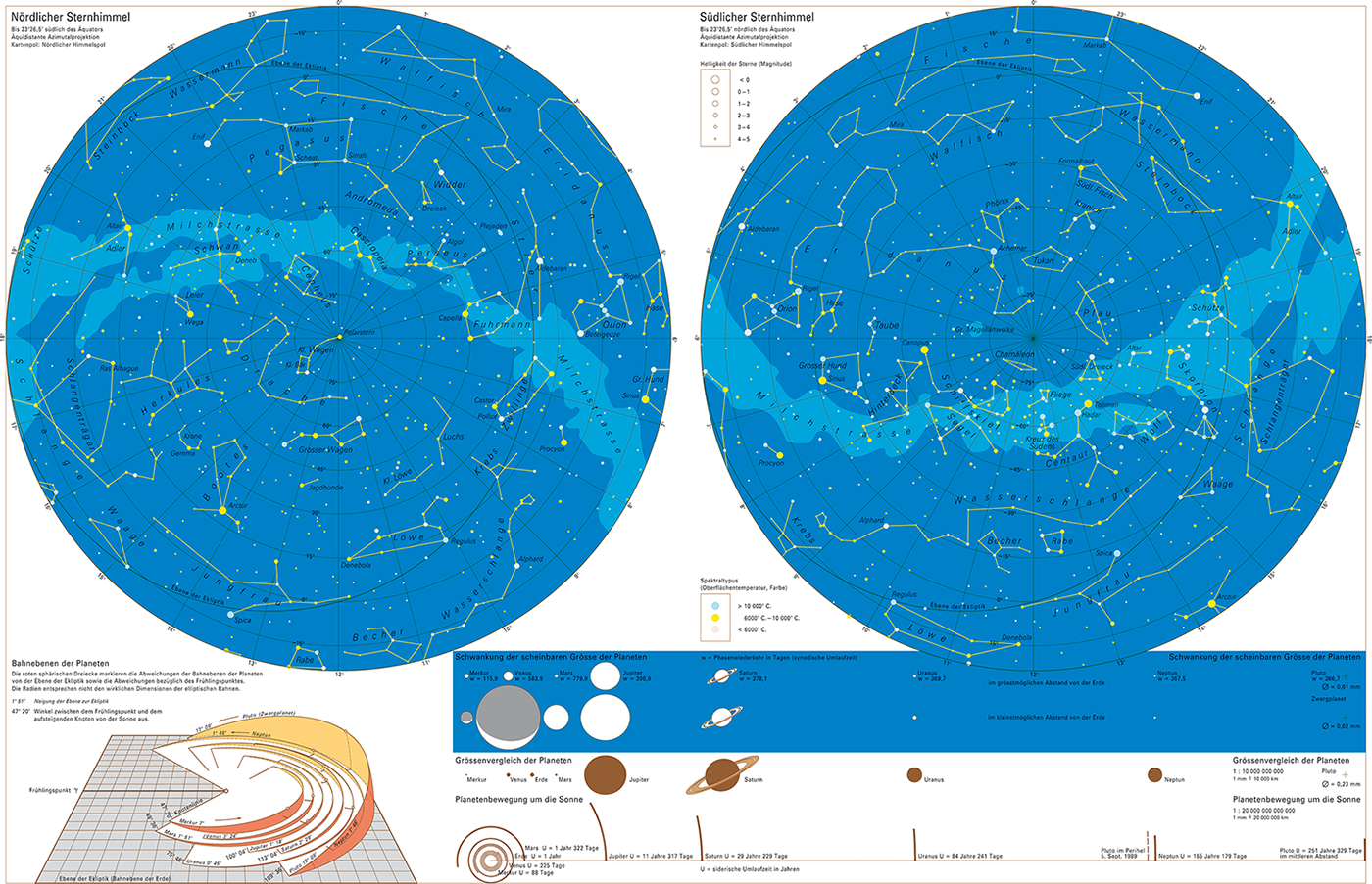
Two pages show the starry sky (figure 1), first of the northern and then of the southern hemisphere. Beneath left we see a nice but small illustration about the inclination of the orbits in relation to earth orbit. Beside, a simple graphic shows the orbital radius of each planet (scale 1:20000 billion), the orbital period of each planet is indicated numerically. Above we have a direct size comparison of the planets (scale 1:10 billion). Another drawing shows the altering of the visible planet sizes for a skywatcher on earth (minimum and maximum).
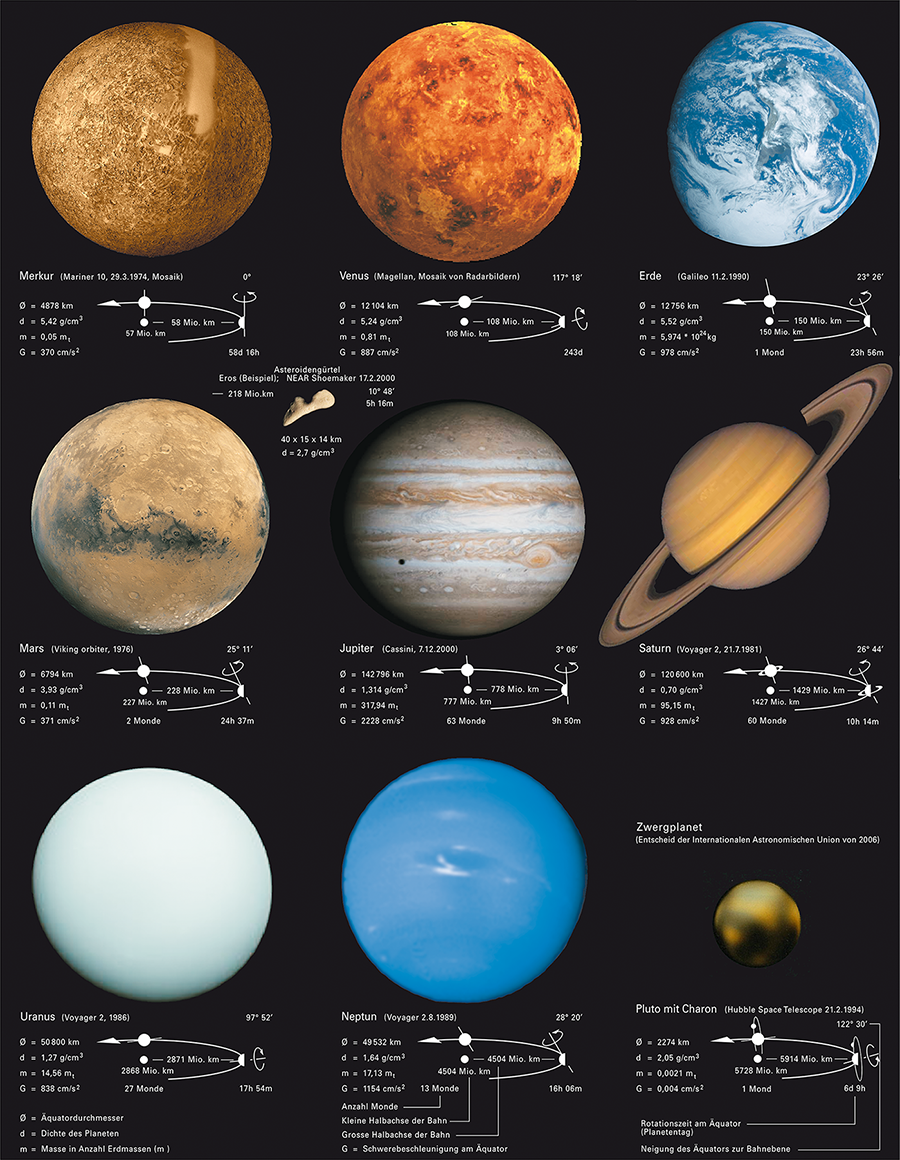
Another page shows a photographical comparison of all planets, enhanced with orbital and physical data. The planets appear quasi in equal size, thus with different scales (figure 2).
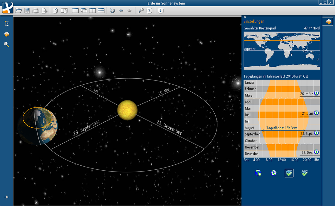
The recent interactive edition of the Swiss World Atlas presents a dynamic illustrative 3D model of the earth's revolution around the sun. It shows the interrelation between axial tilt, season, rotational speed and day length, depending on the geographical latitude (figure 3).
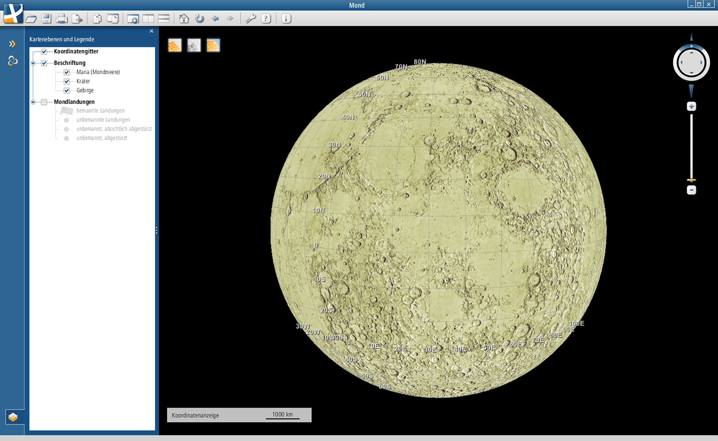
A second 3D visualization shows a virtual globe of the moon, with optional additional information about the landing places of all manned missions since 1969 (figure 4).
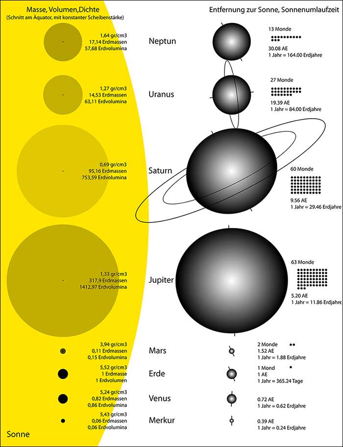
The main orbital and physical characteristics of a planet are probably the first data which an illustrative cartographic model should present. Common known parameters for instance are the number of satellites, size, shape (profile), axial tilt, mass, density, gravity, rotation period, orbital speed, orbital period, surface temperature, and so on. All data for this work was taken from Wikipedia, the free web encyclopedia. In general we should consider that a lot of these precise numbers, which today are provided by numerous websites, are approximated or average values, which are at least necessary to construct an introductory cartographic model. The characteristics of the planets in reality are such different in some cases that, at a first look, it seams to be disputable to show them merged on one atlas page, depicted with simple forms and colors. Jupiter is a good example to explain this thought more precisely: Its rotational speed differs from equator to pole, and there is no surface like on earth. Its density also alters remarkable between outer mantle and core. So, how can we define an accurate and also easy understandable depiction which includes a combination of these special properties? After all we need simplified and clear depictions for an introduction of a student into a scientific domain like astronomy. And, for a better comprehension of all these large numbers, we need at least direct comparisons. This principle was yet followed in the current and the former editions of the Swiss World Atlas. But, as yet annotated, the illustrations are mostly to small and therefore rarely observed. Beyond an enlargement of the named depictions also the arrangement of the graphics could probably be improved. One aim therefore could be the visualization of all planet data in one atlas page, if possible in a well ordered manner. And moreover, in some cases, alternative depictions could be elaborated for a better or more adequate representation of the existing data. Following these considerations I made the following draft (figure 5).
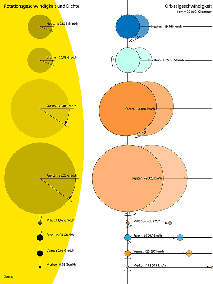
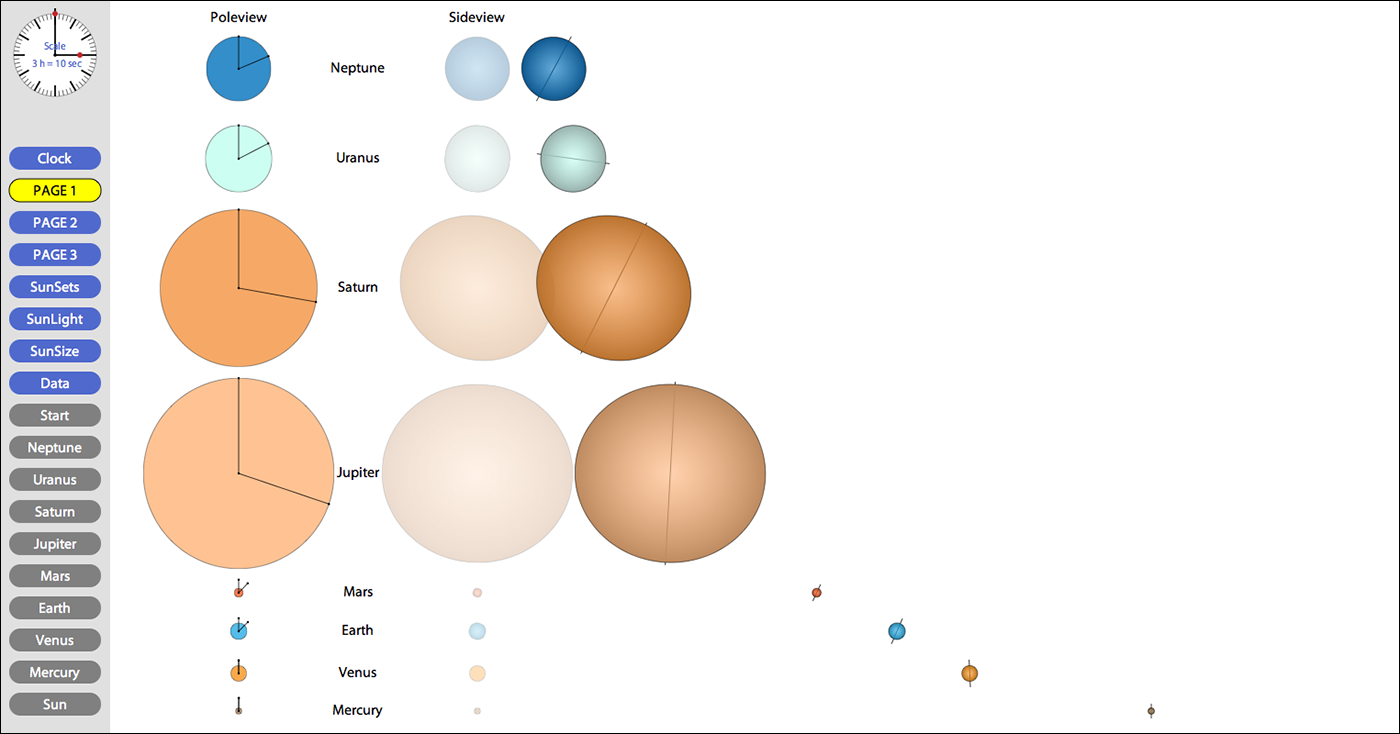
And what about the depiction of some orbital parameters? For example the distance that a planet covers in space during one turn around his own axis? Hence, the next step was to visualize orbital speed and rotational speed. Two different views or perspectives were therefore required: A pole view (yet shown in fig. 5) that shows the equator outline, to visualize the rotational speed, and a side view (also included in fig. 7) to show the profile (shape) and the orbital speed of each planet. Then an appropriate time slot for the visualization of the movements had to be defined. With the distance that Mercury (the planet with highest orbital speed) covers within one hour it was still possible to fit the whole model into the predefined format of an atlas page. And the values for the rotational speed of most planets were also well presentable within the chosen scale: Jupiter for example (with the strongest rotational speed) turns around 36.25 degrees during 1 hour. Venus, with the slowest rotation, turns only with 0.06 degrees within the same time frame. Hence these values could be inherited directly and depicted, with the same scale, in a second draft (figure 6).
The rings of Saturn and Uranus were omitted for a clearer depiction of size and shape. With the presented combination of size and shape comparison on one hand, and the orbital movements on the other hand every planet can be characterized in an easy comprehensible way. The interrelations between some physical and orbital parameters are described by a single illustration. This new model, which could be used also for a new edition of the printed atlas, was the basis for my further developments for the interactive atlas edition.
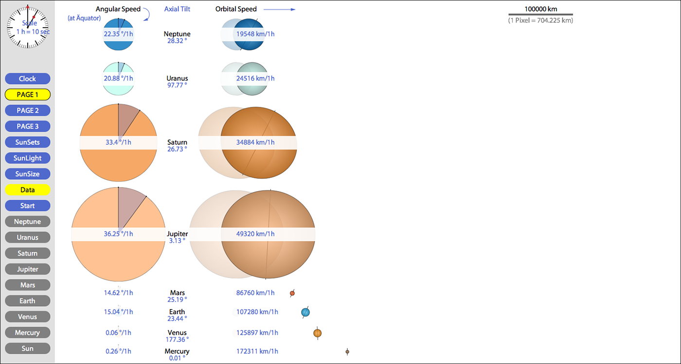
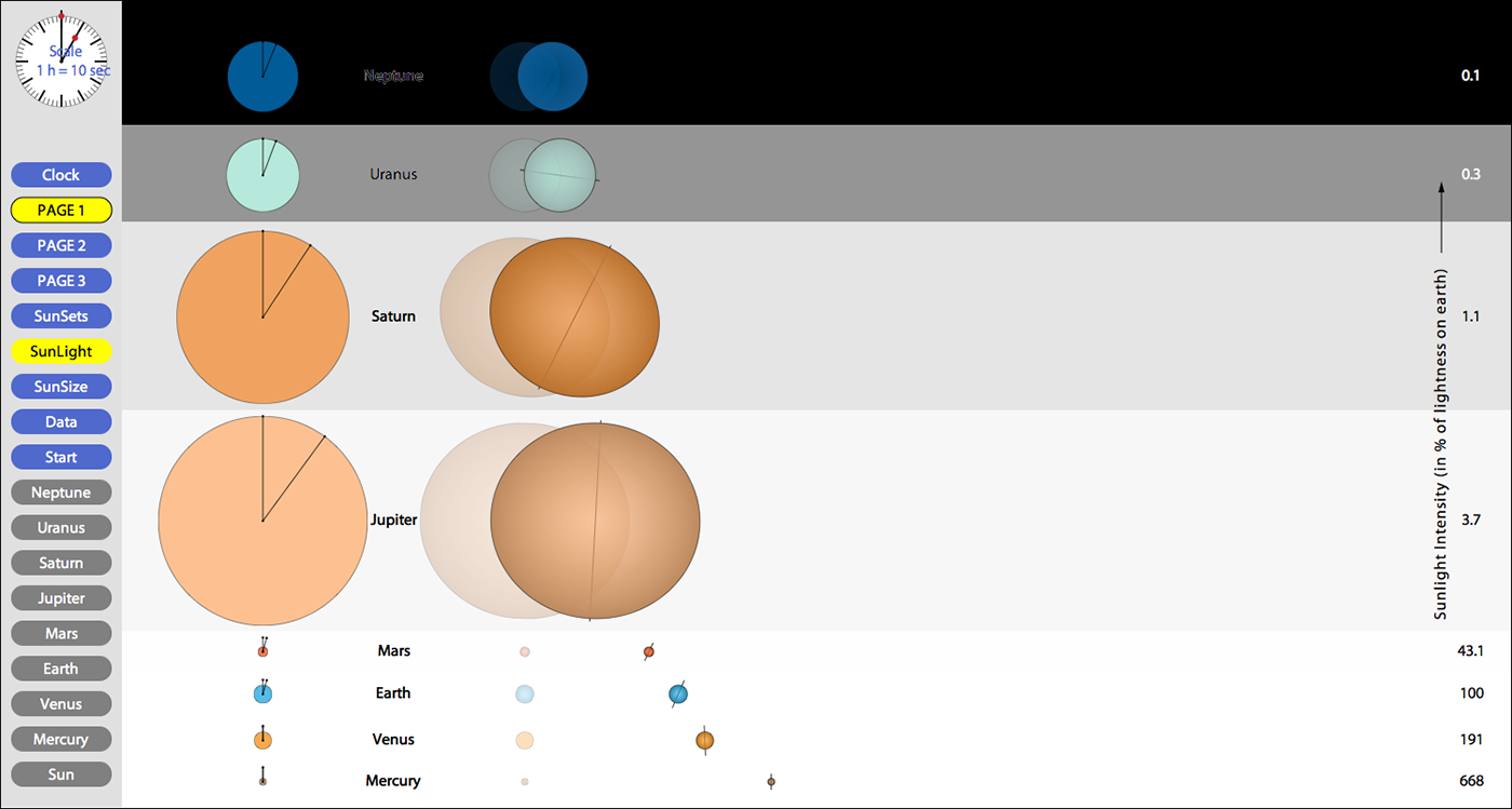
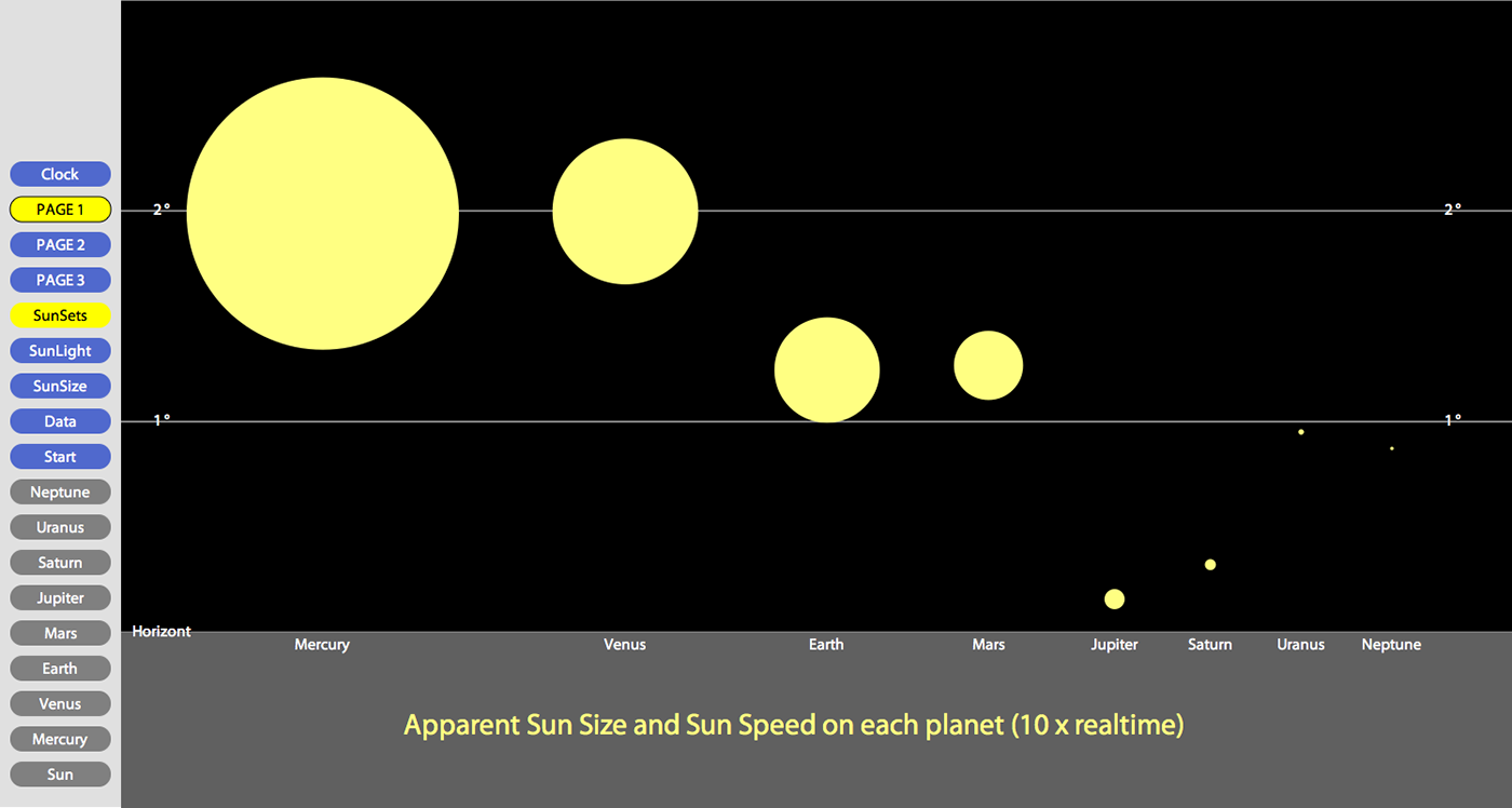
I first separated the graphic into various layers. The user probably wants to select the numerical informations about physical and orbital characteristics of a planet only after a first moment of contemplation. Hence those data can be presented with an optionally visible layer (or additional layer). And further informations, beside the current illustration, can also be provided so (with separate illustrations). As first examples for additional layers I implemented a layer with the numerical data (figure 7), a size comparison with the sun, and the sunlight intensity on each planet (figure 8). With a separate illustration I show the apparent sun size and the sun speed (animated in realtime) on each planet (figure 9).
Actually there is no upper limit for the number of separate illustrations. With a further layer we could show for instance the apparent sizes of the planets for a skywatcher on earth (minimum and maximum), or the animation of a solar eclipse. The control elements (buttons) for the visualization of the additional layers and further illustrations are merged in an area on the left side.
So far so good. Now, another goal during the generation of a new illustrative model is generally, if possible, not to distort impressions the user gained from a former observation of an illustration in the atlas. With this consideration, the orbital radius and orbital period are the most difficult parameters for an accurate graphic visualization. Can they actually be shown in a static graphic without extreme scale distortion?
Or, how can we generally improve the depiction of the extreme distances between the planets? Is this actually possible, without loosing the previously obtained accurate impression about the proportions of the planets and their movements in space? With such considerations we come to the depiction limits of static illustrations in general. The dimensions of the single planet models on one hand, and the model of the whole solar system on the other hand are too diverging. So, how can we resolve our problem?
What about the further relevance of interactivity in this context, beyond the selection and combination of static atlas content? And, what about animated representations in general? The World Wide Web, with its numerous technical standards, offers various technologies to visualize our data. Scalable Vector Graphics (SVG) is a modularized language for the description of two-dimensional vector graphics, or mixed graphics (vector and raster) in XML. The Extensible Markup Language (XML) was designed to represent structured information in a simple text-based format. All types of data can be described: documents, data in general, configurations, books, transactions, invoices, and much more. A knowledge of XML is essential to write or supplement SVG documents directly, without a graphic utility, for instance with a simple text editor. The main benefits of SVG are given especially by the capabilities to enhance static vector graphics with interactivity and animation. With an animated graphic completely new impressions and interrelations affecting the presented subject can be communicated. The options to visualize data with animated graphics are generally almost unlimited. But in this study the focus should remain on the utilization of those functionality that really improves and enhances the already existing model.
First, another possibility to provide further information, beside additional layers or separate illustrations, is the integration of internal and external links. Further SVG-files and subject-specific websites can be integrated to augment our file structure. The provided link in our model becomes visible by moving the mouse over the planet name in the middle of the graphic (figure 10). This effect was implemented with animation of the attributes "font-size" and "fill".
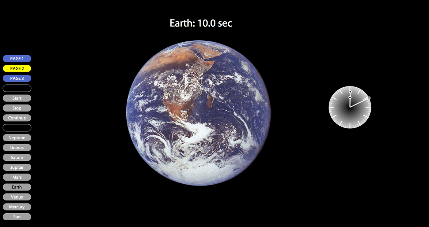
Now, the really new dimension in the use of animated graphics in general is time, especially the continuous modification of an illustration during a defined time slot. The existing model can definitely be enhanced and improved by this functionality. The predefined time slot, which was yet used for the compilation of the static depiction (figure 6), can be inherited for the first implementation. Rotational speed and orbital speed, in direct comparison, within the same scale, become now visible in a dynamic way. The basic model remains the same but is now augmented by the power of motion. After an observation of the first loaded static graphic the animation can be started by using the start button (Figure 11). Replays are also possible. The clock on the upper left side shows us the chosen time scale (3h = 10sec) numerically. The animated pointers always show the process in real time.
Some technical annotations: Multiply used numeric values in the SVG-code are defined by XML-entities. Thus modifications and adaptations of the model can be carried out easily, with a simple text editor. The existing file is quasi flexible, that means parameters can be modified to adapt the whole animation, for instance the animation duration or the time slot of the shown planet motions. This functionality was achieved by accessing the attributes of the SVG-elements with the Document Object Model (DOM). The Document Object Model is an interface that allows programs and scripts a dynamic access to update the content, structure and style of documents. DOM manipulations are not SVG specific and work the same way in all W3C/XML documents (Neumann, Winter, 2009). JavaScript, an implementation of the ECMAScript language standard, is the most popular scripting language on the internet, and works in all major browsers (Internet Explorer, Firefox, Chrome, Opera, Safari). Ecma International is an industry association founded in 1961, dedicated to the standardization of Information and Communication Technology (ICT) (ECMA International, 2011). The Javascript code is not part of the SVG file but only executable by event handlers. Due to the definition of the required variables, functions and methods the newly calculated values, after a modification by the atlas user, are automatically displayed by using the data button. With the definitions in the SVG root element the whole model can furthermore be adapted in size or position on the screen. Because of the wider display format of a computer screen compared to an atlas page higher values for the visualization of orbital speed are appropriate. Two or three hours in our example are adequate to fill the whole screen. On the other hand an observation of the planet movements in realtime is also interesting. At the first look it seems that the planets don't move, but after a short break (2 minutes) we see that Mercury has yet covered a distance equal to its diameter. From the technical view at least almost every parameter could be manipulated on the client side but this is certainly not the purpose of an interactive atlas application. The intention remains always to present the prepared information in the most adequate and clearest way. And therefore the atlas user has to accept some implemented rules of cartographic design.
So far so good. But, what the presented new depiction yet not clearly shows are the spatial dimensions of the solar system. A short look back: Orbital radius and orbital period are two features which can be visualized accurately in a static illustration only without a concurrent depiction of the planets and the sun. Otherwise, like in most common known atlases, we have extreme scale distortions. This consideration was yet attended while editing the depictions of figure 2 ("Planetenbewegung um die Sonne"). In this graphic we see only the planet orbits, and due to the omission of any planet in the same graphic a better impression of the large distances between the orbits is given. Hence, another idea in my investigations was to depict the huge distances between the planets over time, in a second animation. On a virtual flight from the Sun to Neptune, with a specific order of the planets straight behind each other, every planet appears after a period proportional to its distance to the sun (=average orbital radius). Which velocity is required for such a virtual flight? As we know light has the highest possible speed with about 300000 kilometers per second, and it takes 8 minutes and 19 seconds for a light beam emitted by the sun to reach the earth (= 1 astronomical unit). Thus an adequate factor for time compression is still needed, otherwise the atlas user would have to wait too long to see the whole animation (more than 4 hours). I set the flight speed of our virtual spacecraft to 50 c, that means the flight speed is now 50 times faster than light speed. Although this is not possible in physics it helps us to make our illustration feasible. The starting point is located in the center of the sun and the earth for instance appears now after nearly 10 seconds (distance of 1 astronomical unit) (figure 12).
The flight to Neptune takes still about 5 minutes. With such a speed the planets normally would not be visible anymore. Thus I added a "photo view" stop in front of each planet, to get a short impression of its natural appearance. During such a photo stop the animation continues, thus the time slot for a first observation of each planet should not be too long (for example 1 second). Otherwise, the picture of the next planet appears and covers the current one (shortest distance in our animation is between Venus and Earth). It is also important not to degrade the impression of the extreme travel speed with an extended observation of a photo. Above the animated flight visualization I put a scale bar which shows the distances between the sun, the planets, and our current position. At the same time we see a parallel stretching yellow line (left side) which shows the velocity of a virtual light beam, emitted by the sun. In case that the first appearance of a planet in the animation was to short, the atlas user can review the picture by using the related button in the control area on the left side. Furthermore she or he gets some basic information about each planet, similar to the first illustration. An additional system message appears about the potentially still running animation process. The properties of this second animation are completely predefined by the map editor, but, as in the first animation, could also be modified partially by the atlas user (especially the velocity of the virtual spacecraft). Important to show the distances without time distortion is a constant velocity during the whole animation! The user needs some endurance to reach the outer planets, but gets a real impression about the dimensions of our solar system.
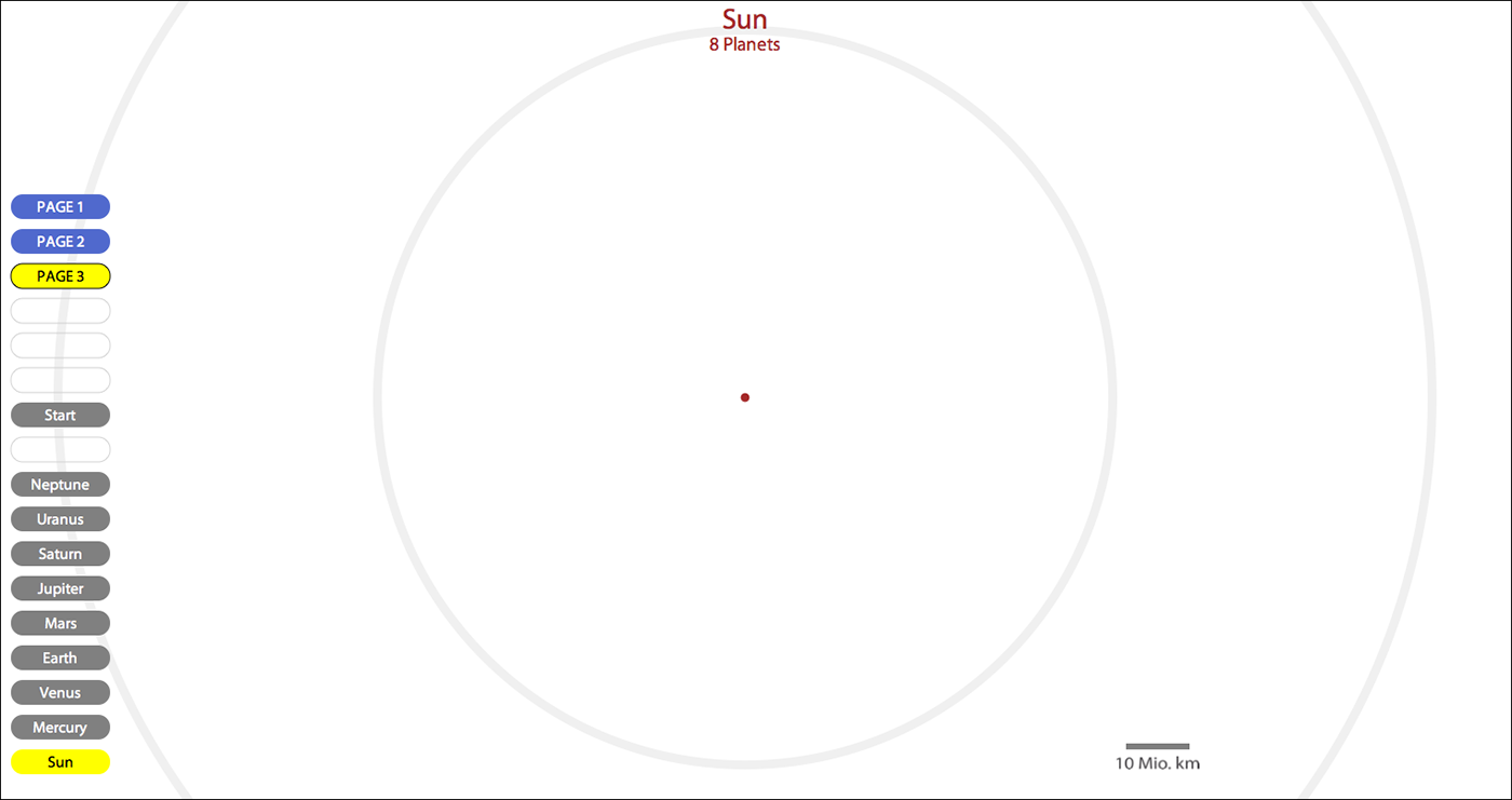
Beyond the described second illustration, which was generated mainly with animated photo representations (raster graphics), I followed a third approach. Because the given potential of transformations in combination with animation allows us actually to integrate the whole solar system into one illustration. In a first overview we only see the planet orbits, depicted generalized with circles, with a minimal stroke width. Even the sun in the center is still not visible, due to small scale. With the first animation triggered by the Sun button we enlarge the whole graphic continuously, whereby an impression of a flight towards the center of the solar system is provided. During this virtual flight, quasi in the opposite direction of the flight in the second illustration, the sun appears slowly, first as a very small point. The proportions between the sun and the orbits of the inner planets become clear now. The orbits are depicted with a stroke width equal to the sun diameter. At least we see only the sun and the orbit of Mercury, due to the limited screen size. Mercury is still to small for being visible at this scale (figure 13).
Beside the format size of our computer screen also the resolution defines the minimally required scale for the visualization of a planet. Then, with a second animation, triggered with the Mercury button, we further enlarge and translate our model to the position of Mercury. Finally Mercury appears as a small red point, in the middle of its orbit line, which has now nearly the width of the computer screen. Thus we have a very illustrative size comparison of Mercury, the smallest planet, and the Sun. Moreover, the orbital speed of Mercury is visible true to scale. After a coffee break we can see the difference between the current position (red point) and the position of the first appearance (blue point).
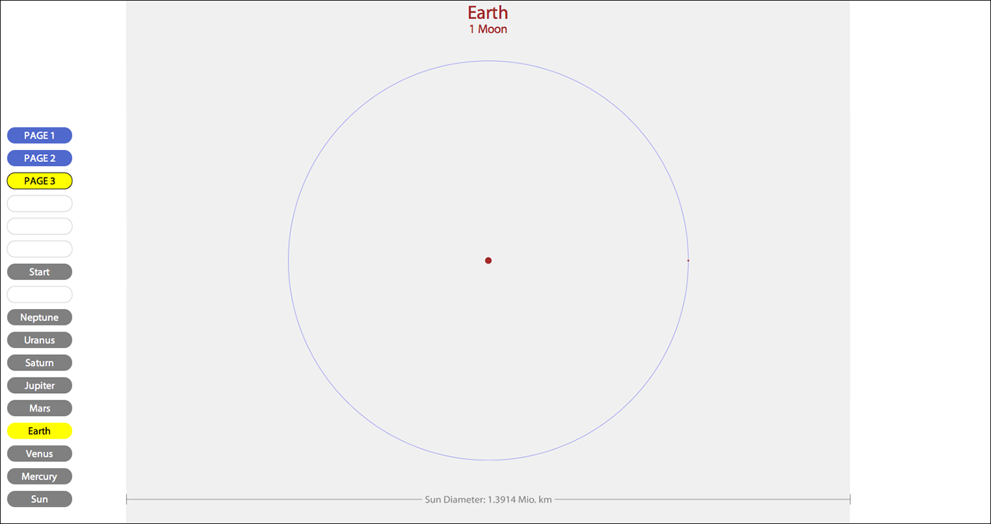
The other planets are observable in the same way. Another illustrative example is a direct comparison of the earth, the moon with its orbit, and the sun (figure 14). Like in the other animations some parameters, like for instance a factor for time compression or a scale factor, can be modified by the atlas user to adapt or enforce the given impressions.
The main goal of the presented work was, beside the examination of the SVG-capabilities in visualization of commonly known astronomy data, the generation of a new illustrative model for the Swiss World Atlas interactive. Relations between some physical and orbital parameters of the planets, and also, in a wider view, correlations between the apparently separated planets in our solar system become visible with the new depictions. The first model generates the impression that the planets are connected somehow with each other, despite the known large distances. Although all planets are arranged within the same scale, on a small area, we see a wider correlation of the planet movements around the sun. With the presented three animations relations to other school subjects (outside the classic geography) can be highlighted by the teacher (for instance in physics). The student can apply knowledge from other school subjects for a better comprehension of the presented topic. A good example therefore is a depiction of the orbital radius, within the orbital speed and rotational speed illustration, with the sunlight intensity on each planet (Figure 9). A short annotation about the law of light intensity could be helpful in this case. The presented model first shows an alternative to the existing illustrations of the solar system in the current Swiss World Atlas (Printed Edition), and then a proposal for an additional module for the Swiss World Atlas interactive (Web edition). Hence, the newly generated 2D-model of the first illustration could finally be used for both atlas editions. The model of the third illustration is a schematic and simplified approach, and can still be improved in terms of realness and detail, to visualize for instance Kepler's laws of planetary motion. Nevertheless, the main information about the true distances and proportions of the sun, planets and orbits in our solar system is already present. Obviously the potential of the visualization of astronomy data with animated SVG is much higher than with static depictions only. Some essential information can be held also in a static illustration. And for an introduction of students into a new subject the depictions should probably be static first. But, after a short phase of contemplation and explanations the lesson should definitely be enriched by animated visualizations.
We can conclude and say that SVG offers the required functionality for the visualization of our selected astronomy data. The results are satisfying. In case of large scale values a higher speed in the last part of an animation is still necessary (third animation). But this is not a major handicap. A few possibilities in the visualization of astronomy data with SVG are shown, and further capabilities still are given. Beside the animation of 2D graphics and photos, an augmentation with audio content is also possible. Oral explanations, well accentuated music or simple sound patterns can be added to enforce learning effects. "The map reader recalls information better when it is presented in a graphically pleasing way and with the use of different media (e.g. images, sound, text, animation)." (Jenny et al. 2008).
Last but not least some further considerations about technical aspects must be taken. With the recent version of Adobe Illustrator, which was used to draw the basic model for the first illustration, a translation of the generated graphics into clear and well arranged SVG code is still not possible. Comprehensive work was first necessary to quasi rebuild the exported SVG-file (reduction of some paths to basic shapes, definition of styles and multiply used elements, entities). An alternative to Javascript, the programming language on the client side, could also be PHP (server side programming). Flash is a very popular alternative to SVG for the presentation of interactive and animated 2D graphics (with ActionScript as the scripting language). It can be executed by the free browser plugin Adobe Flash Player in any current web browser version. But SVG, in contrast to Flash, has the enormous advantage of being open source. (Watt, 2002). SVG supports media elements similar to the Synchronized Multimedia Integration Language (SMIL) 2.1 (W3C, 2011). SMIL 3.0, the current release of SMIL, "was developed to bring presentaton-level interactive multimedia to the Web and mobile devices, ..." (Bulterman, Rutledge, 2009). Another possibility for the generation of interactive 2D animations is given with the Canvas element, which is part of the HTML 5 Specification. But, (...) "the canvas element was never designed to be used in that way (...) It takes a lot of time to redraw complex frames". (Mozilla Developer Community, 2011). Hence, for our issue it's not a feasible alternative.
The Swiss World Atlas interactive is based on Java technology, which today every browser can execute. SVG files can currently be integrated with the Java Batik toolkit. Batik is a Java-based toolkit for applications or applets that want to use images in the Scalable Vector Graphics (SVG) format (Apache Software Fondation, 2010). But the data package, which has to be downloaded therefore first, is still voluminous (about 10 MB). Hence this is still a major handicap for an integration of the developped illustrations, due to the lower atlas performance. Another option to integrate SVG content in Java in general is SVG Salamander, a subproject of Javadesktop (Oracle et.al., 2011). "SVG Salamander is an SVG engine for Java that's designed to be small, fast, and allow programmers to use it with a minimum of fuss." (Oracle et.al., 2011). But this project was started only in January 2011 and is still under development. We cannot yet use it for the integration of our new illustrations in the atlas, for instance due to the lack of JavaScript support. Another option in general is the presentation of the new module outside the main atlas environment, in an independent browser window. The user can navigate and switch without a problem between the two application windows. But, the capabilities of the used web browser version for the execution of SVG functionality are essential in this consideration. As we know, some implemented SVG functionality (like animation) is still not executable by every web browser. SVG is still evolving. But, the temporal change to an appropriate web browser should actually not be a problem nowadays.
APACHE Software Fondation (2010): Batik SVG Toolkit.[http://xmlgraphics.apache.org/batik/index.html] (2010-1-2).
BULTERMAN, D., RUTLEDGE L. (2009): SMIL 3.0. Flexible Multimedia for Web, Mobile Devices and Daisy Talking Books. Springer-Verlag Berlin-Heidelberg (GER).
ECMA International (2011): What is Ecma International.[http://www.ecma-international.org/memento/index.html] (2011-9-24).
EISENBERG, J. David (2002): SVG Essentials. O'Reilly & Associates Inc., Sebastopol. Sebastopol (USA/CA).
FIBINGER, I. (2002): SVG - Scalable Vector Graphics. Markt+Technik Verlag München. München (GER).
HURNI, L. and SPIESS, E. (2010): Schweizer Weltatlas, edition 2010. Lehrmittelverlag Zürich. Zurich (CH).
JENNY, B., JENNY, H., RÄBER, S. (2008): Map Design for the Internet. Institute of Cartography and Geoinformation, ETH Zürich. Zurich (CH).
MOZILLA DEVELOPER NETWORK (2011): Canvas Tutorial.[https://developer.mozilla.org/en/Canvas_tutorial] (2011-9-27).
NASA (2011): NASA, Jet Propulsion Laboratory, California Institute of Technology.[http://photojournal.jpl.nasa.gov/] (2011-9-23).
NEUMANN, A. WINTER, A. (2009): Manipulating SVG Documents Using ECMAScript (Javascript) and the DOM.[http://www.carto.net/papers/svg/manipulating_svg_with_dom_ecmascript/] (2009-12-15).
ORACLE Corporation (2011): Java.net, The Source for Java Technology Collaboration.[http://svgsalamander.java.net/] (2011-9-26).
PETERSON, M.P. (2010): International Perspectives on Maps and the Internet. Lecture Notes in Geoinformation and Cartography. Springer-Verlag Berlin Heidelberg. Berlin (GER).
SCHWEIZER WELTATLAS (2010): EDK Schweizerische Konferenz der kantonalen Erziehungsdirektoren (Publ.). Schweizer Weltatlas - Atlas Mondial Suisse - Atlante Mondiale Svizzero. Lehrmittelverlag Zürich. Zurich (CH).
STELLARIUM (2011): A Free Open Source Planetarium.[http://www.stellarium.org/].
SWISS WORLD ATLAS INTERACTIVE (2011): EDK Schweizerische Konferenz der kantonalen Erziehungsdirektoren (Publ.) (2010). Internet access to the free version via website of the "Swiss World Atlas":[http://www.schweizerweltatlas.ch/en] (2011-10-4).
W3C, Word Wide Web Consortium (2005): Document Object Model (DOM). January 19, 2005.[http://www.w3.org/DOM/] (2011-9-24).
W3C, Word Wide Web Consortium (2011): HTML 5 Specification, 4.8.11. The Canvas Element.[http://dev.w3.org/html5/spec/Overview.html#the-canvas-element] (2011-9-26).
W3C, Word Wide Web Consortium (2011): JavaScript Introduction.[http://www.w3schools.com/js/js_intro.asp] (2011-9-24).
W3C, Word Wide Web Consortium (2011): Scalable Vector Graphics (SVG) 1.1 (Second Edition). Recommendation, 16 August 2011,[http://www.w3.org/TR/SVG/] (2011-9-24).
W3C, Word Wide Web Consortium (2011): Scalable Vector Graphics (SVG) Roadmap.[http://www.w3.org/Graphics/SVG/WG/wiki/Roadmap] (2011-8-31).
W3C, Word Wide Web Consortium (2011): Synchronized Multimedia.[http://www.w3.org/AudioVideo/] (2011-1-27).
W3C, Word Wide Web Consortium (2011): XML ESSENTIALS.http://www.w3.org/standards/xml/core (2011-9-24).
WATT, A. (2002): Designing SVG web graphics. New Riders Publishing, Indianapolis. Indianapolis (USA/IN).
WIKIMEDIA FOUNDATION (2011): WIKIPEDIA, The Free Encyclopedia.[http://en.wikipedia.org/wiki/Planets] (2011-9-23).
WIKIMEDIA FOUNDATION (2011): WIKIPEDIA, The Free Encyclopedia.[http://en.wikipedia.org/wiki/Kepler%27s_laws_of_planetary_motion] (2011-9-26).
Special thanks to Hans Rudolf Baer for translation support, useful hints and fruitful talks.